

Recent Projects: Print & Digital Ad Campaign
This client has a unique brand color combination of teal, chartreuse and orange. Over the past year I've been working to refine the way the colors are used to highlight important information, but not be overwhelming. SCCCU is a friendly and community-oriented credit union, and we've introduced an underlying dog theme to many of their images. It's not part of the marketing plan overall, but it adds a friendly feeling and the team loves it.

Recent Projects: Website Makeover
JGS Resources provides transaction and advisory services for the waste management industry. They asked me to update their site to make it more visitor friendly and modern. I organized the information in a hierarchy to break up sections of content and make it easier to read, especially on a mobile device. Waste management is the industry, but JGS provides personal service. I selected photos that would reinforce the service aspect instead of simply showing the
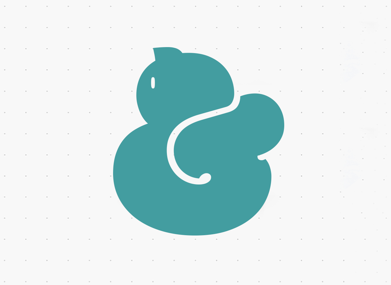
The Catpersand
When I get a new font, I love to see what options are included for special characters and alternates. To do this, open up a new Illustrator file, and type something. Highlight the text and change it to the new font. Then go to Window > Type > Glyphs. A new pane will open with the full font, special characters, and alternates. Click on a glyph to select it; double-click to insert it in the line